![]() Article by DESH Team
Article by DESH Team
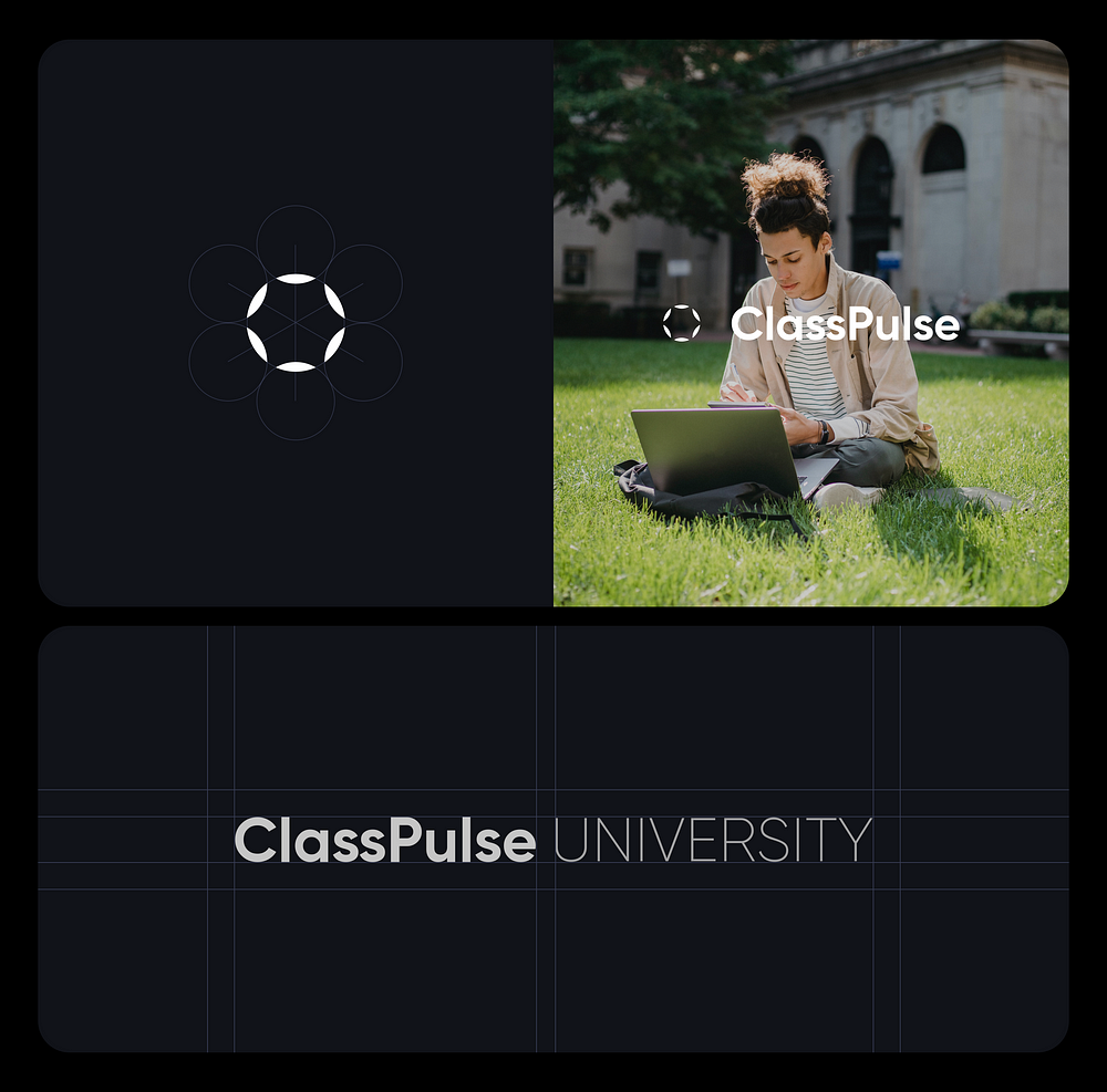
Today, we’re thrilled to share the story of our team at desh.team as we developed an online course platform for ClassPulse University. This innovative learning hub offers access to a diverse range of courses and materials designed for those eager to enhance their skills and take their careers to new heights.
Our project was brought to life by a global team of educators, tech innovators, and lifelong learners. Together, we share a deep-seated belief that continuous learning is the key to unlocking success and fostering career growth.
In today’s feature, we’ll spotlight our collaborative efforts in web design and graphic design.
Let’s dive in!
Web site
Ensuring your website reflects your essence in the best possible light is paramount. It’s about standing out amidst competition and offering your visitors an experience that’s both personal and distinctive.
By blending visually captivating design elements, intuitive navigation, and engaging content, we craft websites that immediately captivate visitors. It goes beyond mere aesthetics; it’s about delivering a tailored and unique encounter that resonates with your potential clientele.
Working closely with clients who possess a deep understanding of their audience and desires, we meticulously analyze the current user experience and competitors. Through collaborative efforts between our creative team and the clients, we develop a platform aligned with user goals and desires.
Our design philosophy was straightforward: simplicity and modernity. We focused on minimalist designs to highlight key information without overwhelming users.
Design system foundations
Establishing solid foundations is crucial for crafting simple and engaging end-to-end user experiences. This is achieved through maintaining consistency in text, spacing, color, and shape.
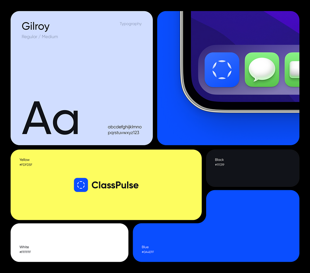
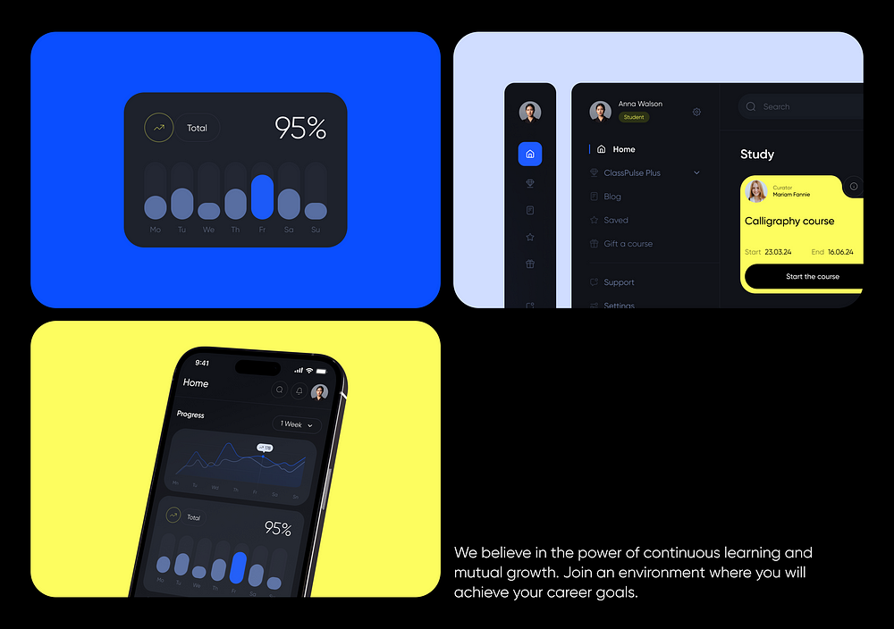
Our color scheme aims for strong contrast and modernity, blending dark tones with bright, cheerful accents of yellow and blue for an impactful visual impression. Colors serve as a conduit for consistent interactions with products and should be utilized to provide contextual cues, expressing hierarchy and status.
Typography plays a vital role, selected for its readability and friendly aesthetics, creating a modern and inviting space for students. The chosen font’s open shapes lend themselves well to both body text and headings, ensuring clarity across all content.
When it comes to form, elements with rounded corners exude a sense of sophistication compared to sharp, rectangular shapes, adding to the overall sleek design.
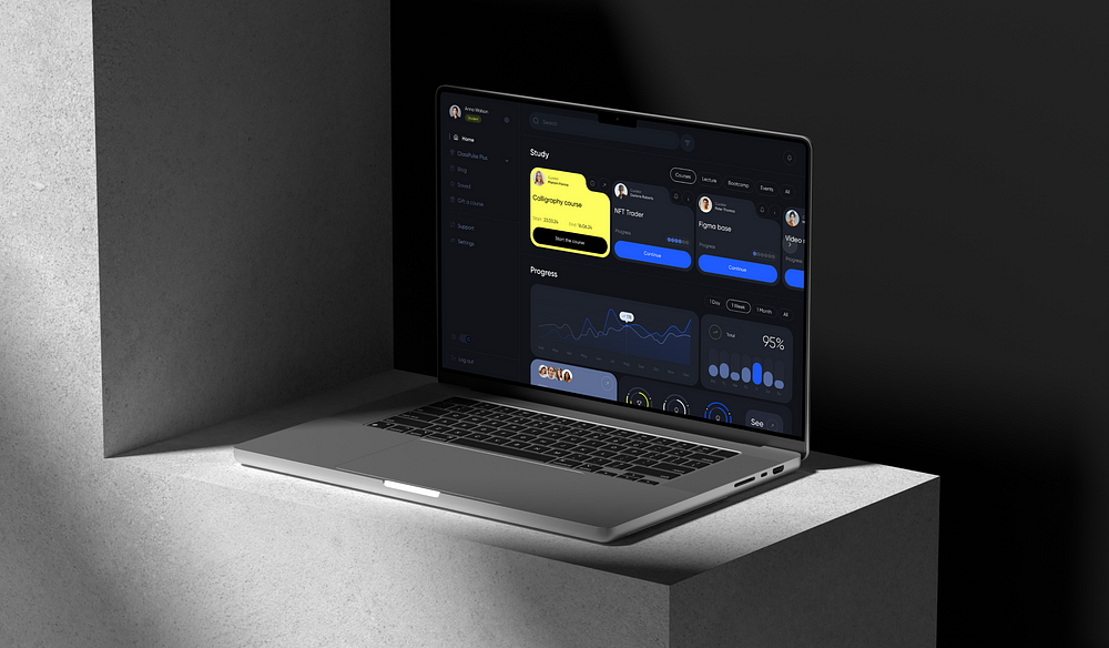
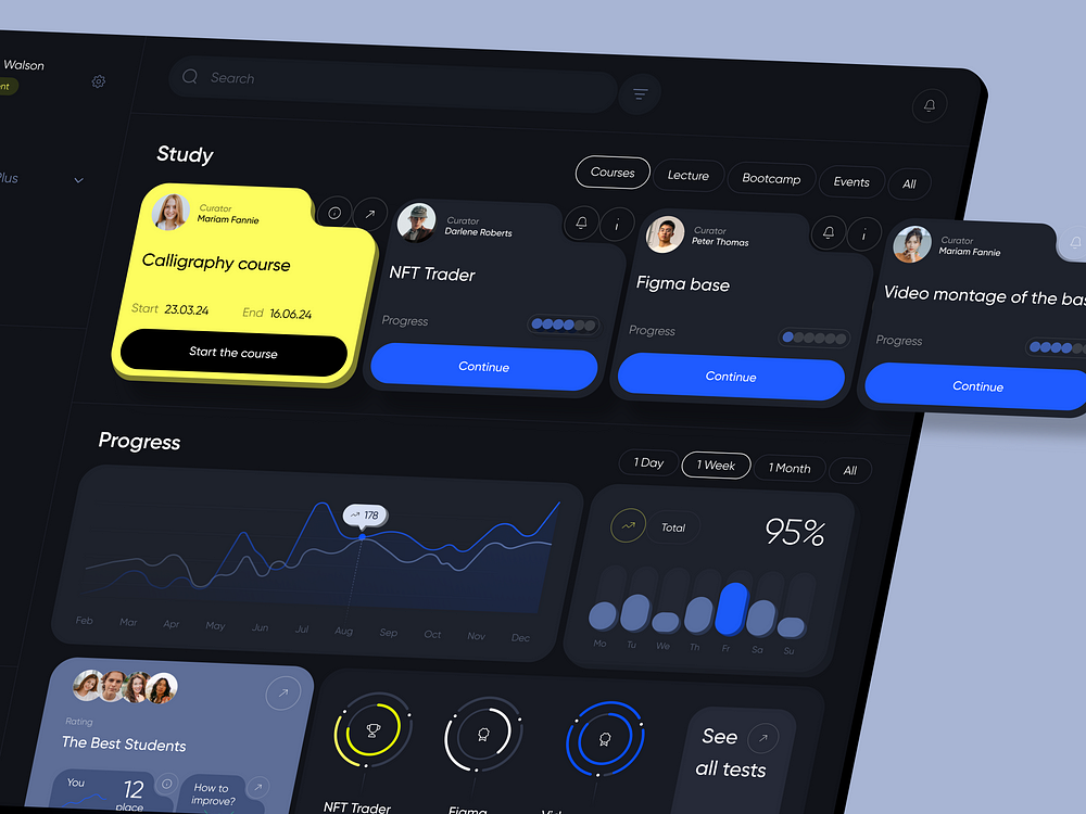
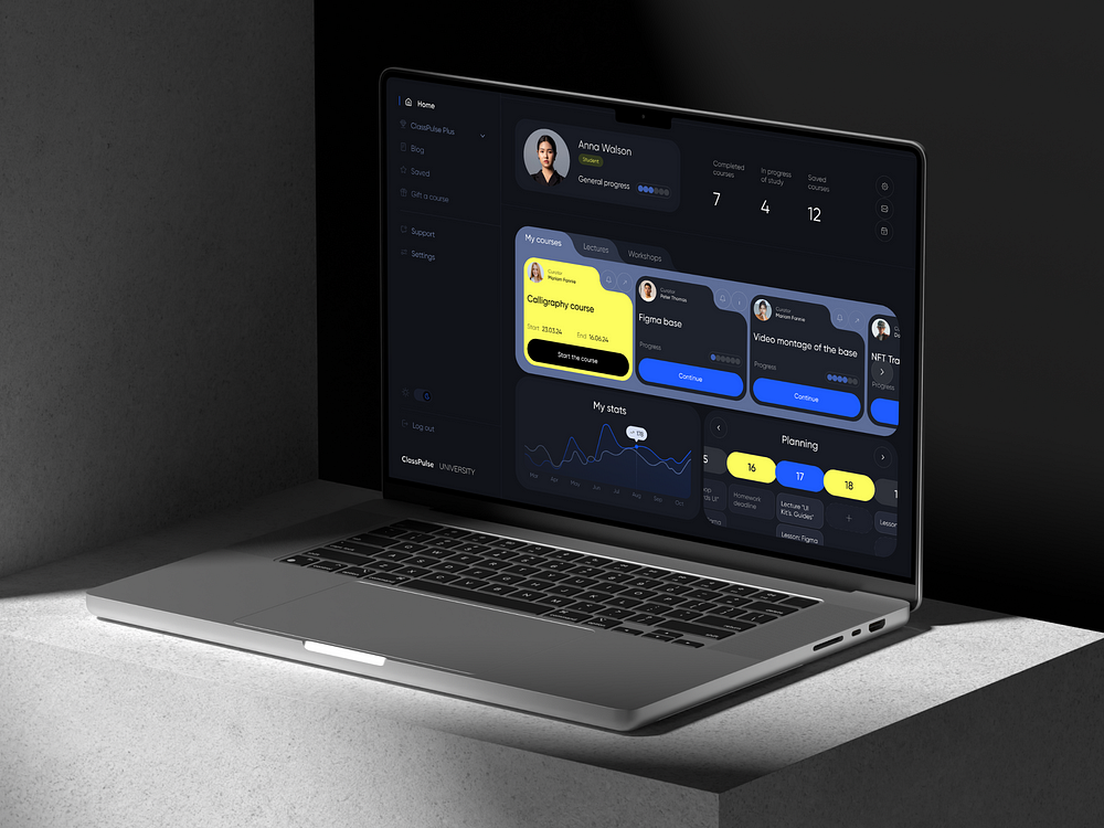
A bright and airy home page layout enables effective integration of various types of content. This includes a comprehensive list of all courses, strategically utilizing accent colors to highlight the most popular ones. Additionally, showcasing students’ progress in their studies serves to boost motivation.
We’ve gathered all essential student indicators and structured them into a clear and intuitive dashboard. This ensures that users can effortlessly process information without experiencing cognitive overload.
A robust visual hierarchy allows website visitors to quickly browse and scan pages, seamlessly moving from one section to another and immersing themselves in the service’s functionality and benefits for teachers and students.
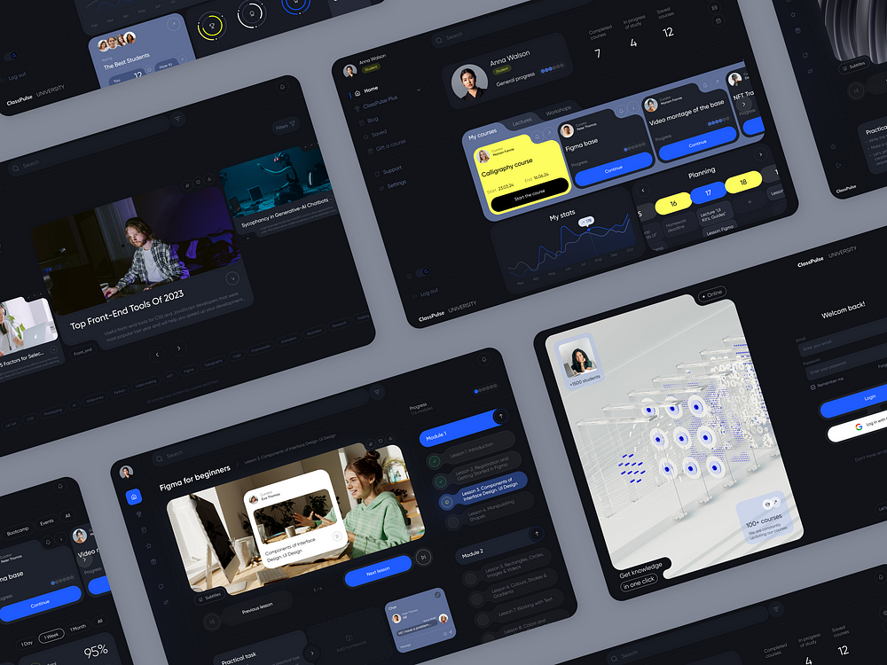
Thanks to our design system, which incorporates consistent card forms, rounded edges, and recurring patterns, we’ve not only achieved uniformity across all pages but also cultivated a distinctive appearance. This curled aesthetic is particularly significant for our target audience, enhancing brand uniqueness and recognition while showcasing the company’s technological prowess.
Let’s delve deeper into how the grid functions across various pages.
In a survey of 115 users regarding their preferred device mode, approximately one-third favored dark mode, another third opted for light mode, and the remaining third utilized a combination of both. Hence, we decided on a dark theme because it:
- Alleviates eye strain
- Conserves battery life
- Offers aesthetic appeal
- Enhances accessibility for individuals with visual impairments, such as cataracts
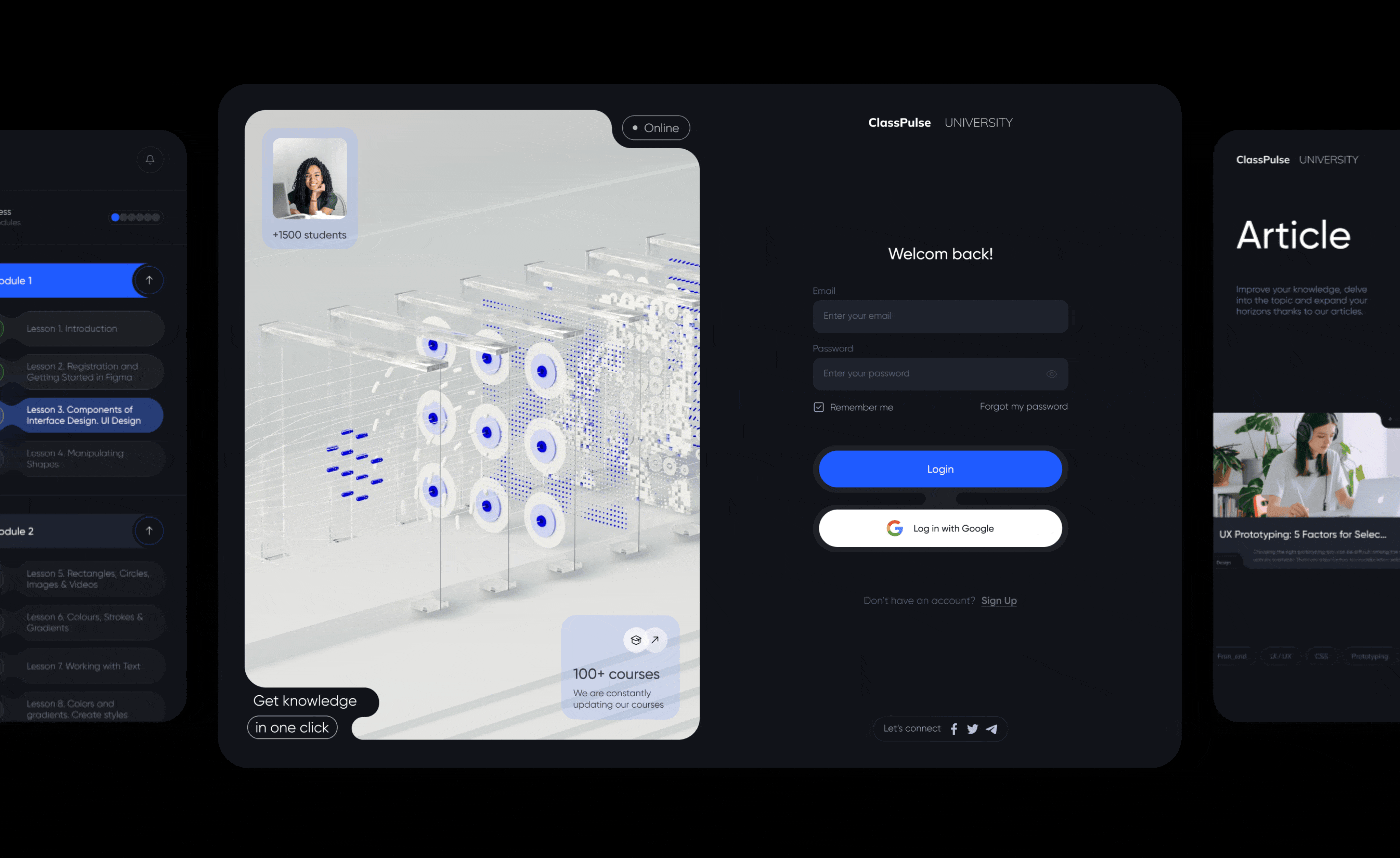
One of our most frequented pages is the lesson page, where we’ve revamped the structure to incorporate all essential features for the user’s convenience. This includes headers, breadcrumbs for seamless navigation, lesson-titled videos, and the ability to switch between lessons directly on the page. We’ve also implemented progress tracking across all lessons, ensuring users always know where they stand in their learning journey, supported by visual indicators.
As an additional feature, we’ve integrated a chat function with the teacher. This allows users to ask questions promptly as they arise, fostering a sense of engagement and involvement in the learning process.
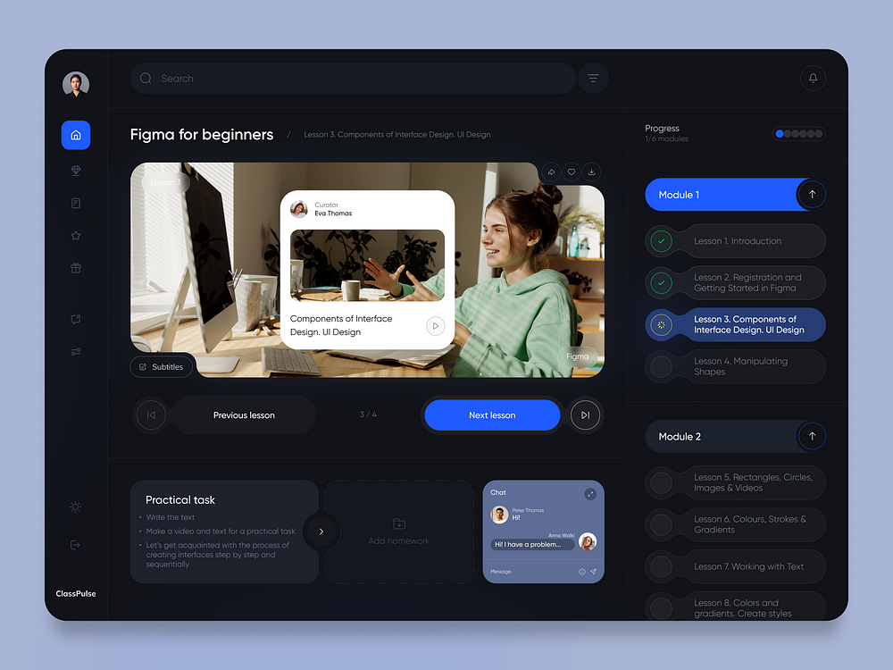
The user’s profile is a comprehensive hub housing all pertinent information regarding study progress, statistics, and a calendar feature ensuring users stay on top of their study plan and never miss a class. Personalization is key, empowering users to tailor their schedules within the calendar if they’ve opted for flexible training options, as well as customize their profile settings.
Moreover, the left side menu offers swift access and seamless navigation across the platform, ensuring users can effortlessly explore and utilize its features.
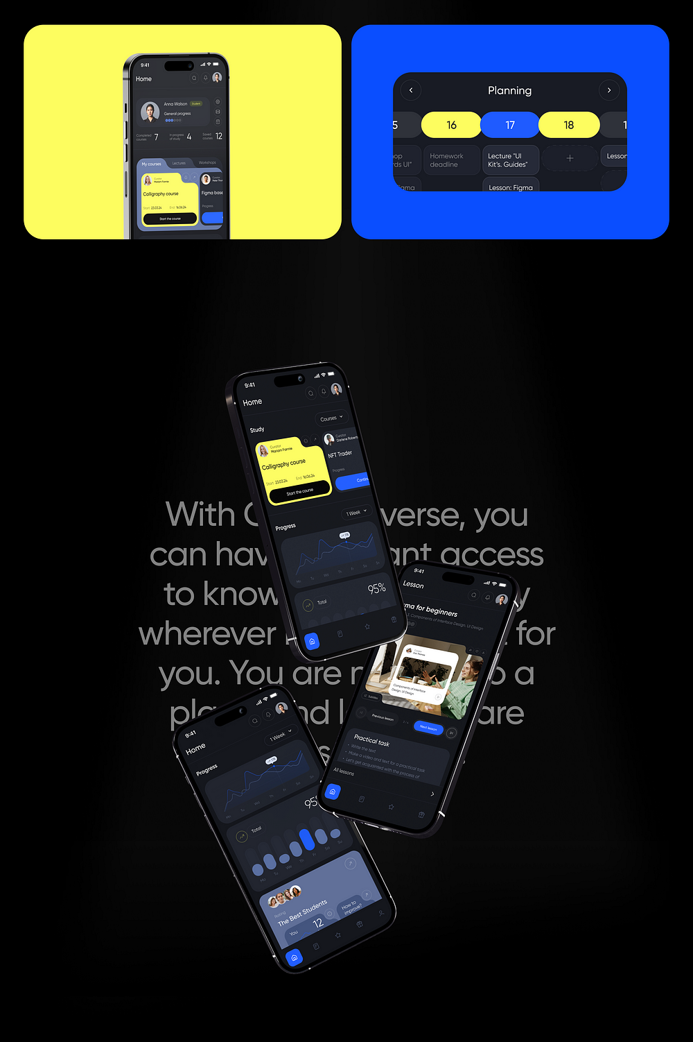
Ensuring accessibility and ease of use for learners everywhere posed a significant challenge, leading us to develop a mobile version of the platform. Recognizing the prevalence of mobile usage among younger generations, offering a mobile application enhances the platform’s appeal and accessibility.
Furthermore, mobile versions are designed to adapt seamlessly to various screen sizes and device capabilities, ensuring a consistent user experience regardless of the device being used. This approach not only enhances accessibility but also ensures a smooth and engaging learning journey for all users.
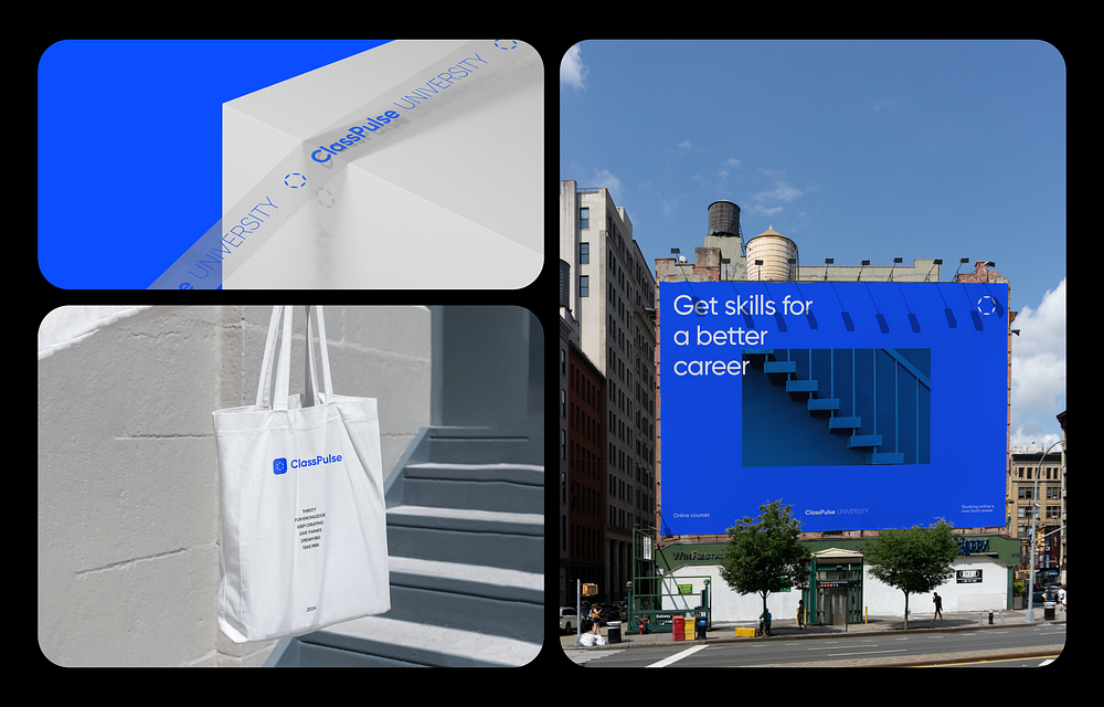
In our team, we believe in tackling each challenge comprehensively, fully immersing ourselves in the client’s objectives. In addition to the primary task of designing the platform, we took it a step further by creating a new logo and branding. This approach ensures that every aspect of the project aligns seamlessly, from visual aesthetics to brand identity, resulting in a cohesive and impactful solution for our clients.